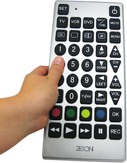
For the image above, the features all appear about the same size, however they are differentiated by shapes: squares, triangles, and circles. The hierarchy of the shape is almost undeterminable. The main hierarchy feature here is the color channel. So, shape AND color help signify the hierarchy in the image. The four colors really pop on the channel changer which is funny in this instance because usually attention is drawn to those buttons for a purpose, however, I am not sure what these four colors denote on this channel changer. I would assume the play button and power button would be emphasized with color or size, but this is not the case in this image.

In the image above, hierarchy is ultimately denoted by color. Through the clutter of lines, the user is quickly drawn to the pop of the color on top of gray background lines. Color over shape is the definite case in the image. The width of the colored lines is constant which doesn't denote importance or hierarchy over the other colors. However, there is a hierarchy above the gray background lines because of their subtlety and skinnier width. Different colors and hues are the important feature channels in this image. They clearly show that they are railway lines of importance.
