David Kalkbrenner

Visual Design Literacy

DAI 323

DAI 323

Sunday, July 11, 2010

Ex 15: Movement/Motion


This image of singer/songwriter, Elliott Smith, was taken during a photoshoot with photographer Autumn de Wilde. The image consists of Elliott Smith and a balloon which appears to be floating away from him. The idea of a balloon lets us know that movement is taking place. We know the balloon is not remaining still, but that there is motion implied. Balloons rise when not contained, so if the picture were to come to life, we can assume the balloon will continue its rising and its degree of motion.


The image above of a girl whom appears to be on a rope swing is a good example of implied motion. As a user we know there is movement or motion in the image because if she were still her hair would lie down as if normal. However, during mid swing, we understand her hair gets caught in the wind and thus implies motion. Looking at the image we can automatically assume she is not standing still getting ready to start the rope swing, but she is in face mid-rope swing.


EX 13: Dimension/Scale/Depth


I've always been interested in album art as I am a huge music fan. This Camp Lo album above just happens to be one of my favorite hip hop albums ever. It's a bad image of it, but you get the point. The overlapping and relative height of all the people create the illusion of space. All of the people on the dance floor are overlapping creating a foreground and background. It allows the user to understand who is front and center in the image and who is a part of the background. And the relative height shows people in the background as a smaller size than the foreground people. We all know the people in the background aren't actually half the size of the people in the foreground, they are just further away so it creates that illusion. It would appear really weird if the people on the railing were the same size. Something would be off in the image.

Ex 11 - Tone and Color


a. Tone is working in this concert poster because of the few colors chosen in it. The warm shades of color give a nice psychedelic feeling to the poster and even without knowing Jimi Hendrix's music, one could imagine how the show may go even without attending.

b. Tone is working best with shape throughout the poster design. The differentiation between the tone and circles work great together to again, get across the psychedelic feeling of the poster. The size of the circles and different tones really make the poster pop and almost give it an optical illusionary sense right around where Jimi's afro and the other two afros meet.

a. The colors chosen in the design work really well with the idea of the poster. I think they are a little in between warm and cold and that they could be closer to the warm side to intensify the psychedelic aspect of the poster. But they are all in the same range and don't clash and all work together really well.
b. The colors work really well with scale. You look at the smallest circles then to bigger sized circles, the faces in the middle and then the mass of circles below the faces. You get a real range of size and scale filled in by the well chosen colors.


Wednesday, July 7, 2010

Ex 9 - Basic Elements: MAGAZINE DESIGN

Texture: I've always enjoyed the cover art for Paste Magazine. All of their art and spreads in fact. For this cover of Paste Magazine, surrounding Ryan Adams' face is meant to be an optical texture of some sort that blends in with his shirt and a little with his face. The texture created looks to be a soft aspect which plays in part color wise with the shirt he is wearing. It also works well with the contrast of the darkness of the hair. It is allowing his hair to be the dominant part of the cover and leaves everything else in a sense of subtlety.

TONE: The cover above demonstrates the basic element of tone very well. The hard edges separating each tone create a distinct difference of tones. The whiteness of the image which blends in to Philip Seymour Hoffman's face is barely a shade darker than his face which creates an interesting almost bleed of white into his face on just his forehead. His glasses and below are separated by a darker tone and creates more of a hard edge. It gives a since of separation of light and dark values.

COLOR: Hue & Brightness - The cover art above best demonstrates the basic elements of Hue and Brightness. The background behind Ben Gibbard is constructed of a yellow hue which is enhanced by an added brightness to make it appear as if the sun is directly behind him and bursting around him making him shine.

Ex 8 ILEARN / Basic Elements 1


Ex 7 - ILEARN / Syntactical Guidelines


Ex 6 - Visual Language Syntax

Tattoos have always gained my interest. Above is a picture of rapper Lil Wayne. He is nearly covered in body ink. Tattoos are a form of decorative body modification and I believe they communicate a personal message about oneself. In this particular case, Lil Wayne wants people to know what gang he is in, what music label he is affiliated with, or anything as simple as short phrases he thinks are important to his life and wants people to see. This is communicated with bold and script typography, graphic images, and various symbols. This communication about oneself is communicated in the clearest way possible...it is now a part of his body for the rest of his life. Lil Wayne is showing his freedom and independence with his tattoos and it shows that he is using his body as an art form.

Ex 5 - Visual vs Symbolic Language


The world rests on money
We rely on money
Money weighs the world down

EX4 - Visual Thinking Research


Initially, I misread the way to solve the problem. I thought you just had to find the two colors that had the same shapes showing; not overall matching area. So I thought it was going to be a quick cutting out of the shapes and then matching them (image 1). I quickly found out neither of two of the four colors showing matched. I reread the directions and looked at the puzzle a little closer and noticed the faded background and revisited the Images in Action PDF and went about a new way of solving the puzzle. It was clear that from the cutouts it was too hard to determine which areas were exactly the same. There needed to be common areas to decipher the puzzle. My friend and I then completed the background over the colored circles (image 2) and then counted out the common features of each color. The GREEN and BLUE each had 10 outter similar shapes and of course the 4 similar inside shapes resulting in green and blue having the same total visible areas.

Tuesday, July 6, 2010

EX4 - Visual Thinking Research


With this puzzle to solve, it was very easy to determine patterns because there are only three objects. It was also easy because out of the three objects, they only contain two different shapes. I just had to pay attention to proximity and direction of the objects. With this particular puzzle it was easier to do it on the computer in photoshop because I could rotate and align one bracelet up with the other two to find and match the similarities and ultimately determine which one was the same. However, when noticing that neither linked up, I realized I had to do more to find the two matching bracelets. So my friend and I knew we had to flip or see the inverse of one of the bracelets. Luckily after we made the inverse of the first one, through process of elimination we found the top left and bottom middle one were identical.

Tuesday, June 15, 2010

Assignment One: Hierarchy


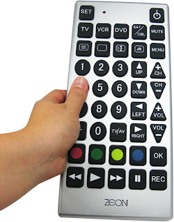
For the image above, the features all appear about the same size, however they are differentiated by shapes: squares, triangles, and circles. The hierarchy of the shape is almost undeterminable. The main hierarchy feature here is the color channel. So, shape AND color help signify the hierarchy in the image. The four colors really pop on the channel changer which is funny in this instance because usually attention is drawn to those buttons for a purpose, however, I am not sure what these four colors denote on this channel changer. I would assume the play button and power button would be emphasized with color or size, but this is not the case in this image.


In the image above, hierarchy is ultimately denoted by color. Through the clutter of lines, the user is quickly drawn to the pop of the color on top of gray background lines. Color over shape is the definite case in the image. The width of the colored lines is constant which doesn't denote importance or hierarchy over the other colors. However, there is a hierarchy above the gray background lines because of their subtlety and skinnier width. Different colors and hues are the important feature channels in this image. They clearly show that they are railway lines of importance.